

Navigation Redesign
Reimagined the navigation system to elevate UX and brand digital presence.
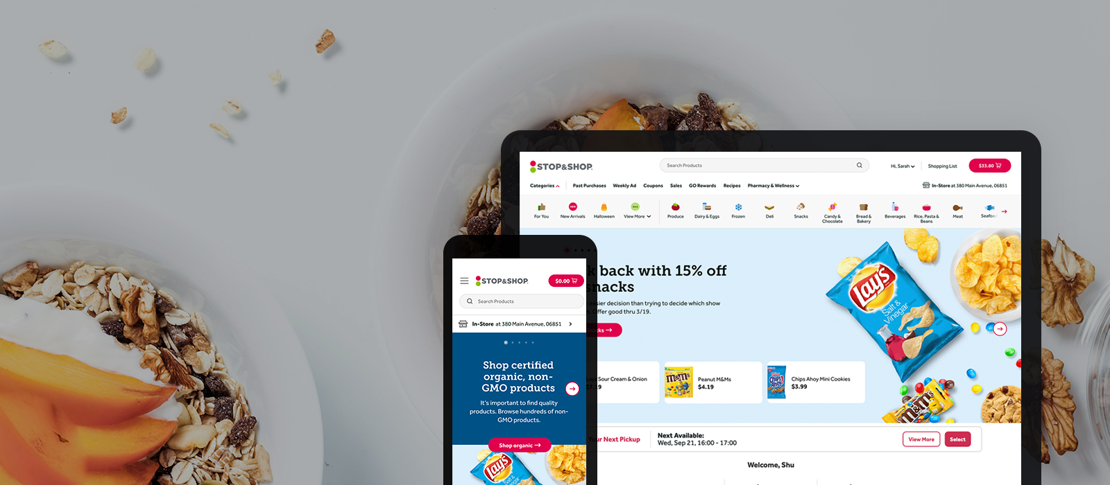
Navigation is the foundation to any digital experience.
Background
The current navigation was designed and launched three years ago. Since then, we have been continuously monitoring the usability and performance of the navigation. There are many researches and testings leading to the full redesign of our current navigation. See below:
Benchmark Tree Test (Sep 2021)
Browse Aisles Diary Study (Nov 2021)
Benchmark Usability Test (Dec 2021)
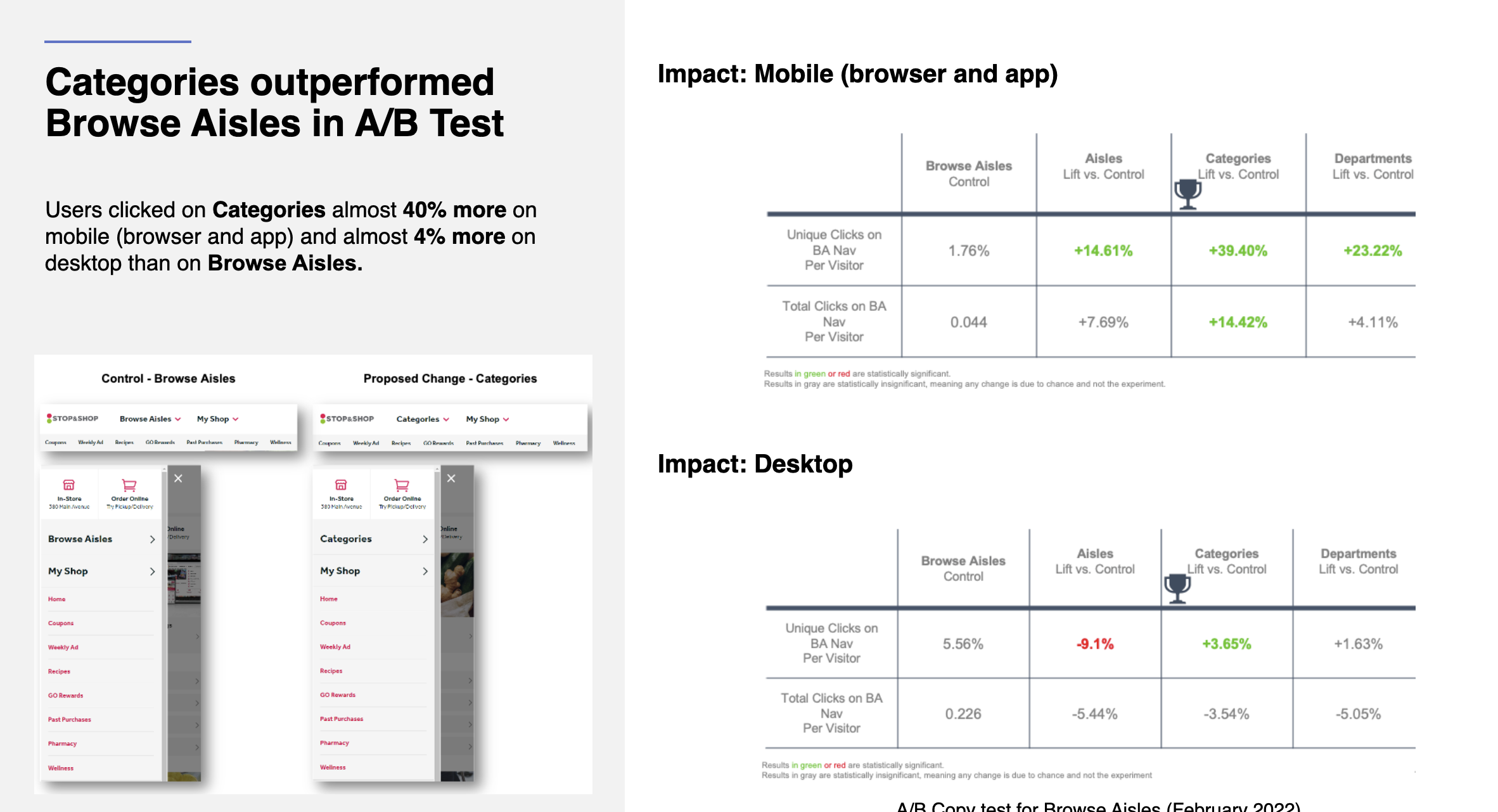
A/B Test - Copy Test (Feb 2022)
Browse Aisles Open Card Sort (Feb 2022)
Tree Tests to inform IA (Apr 2022)
The Problem
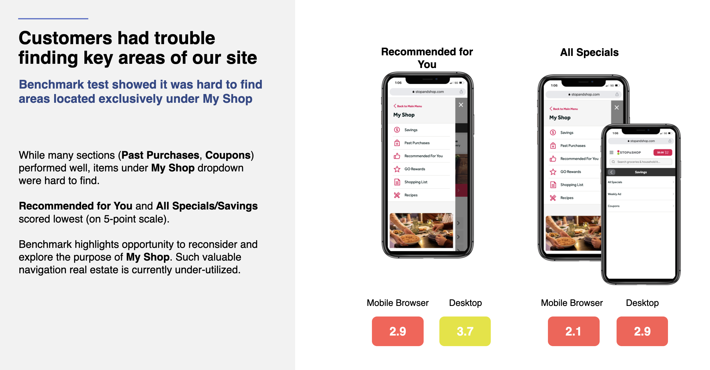
Low Findability
We’ve discovered insufficient within-site traffic to some mission-critical pages due to the low fundability of our navigation.
(I.e., recommended for you page has less than 1% site traffic.)
Lacking Inspiration
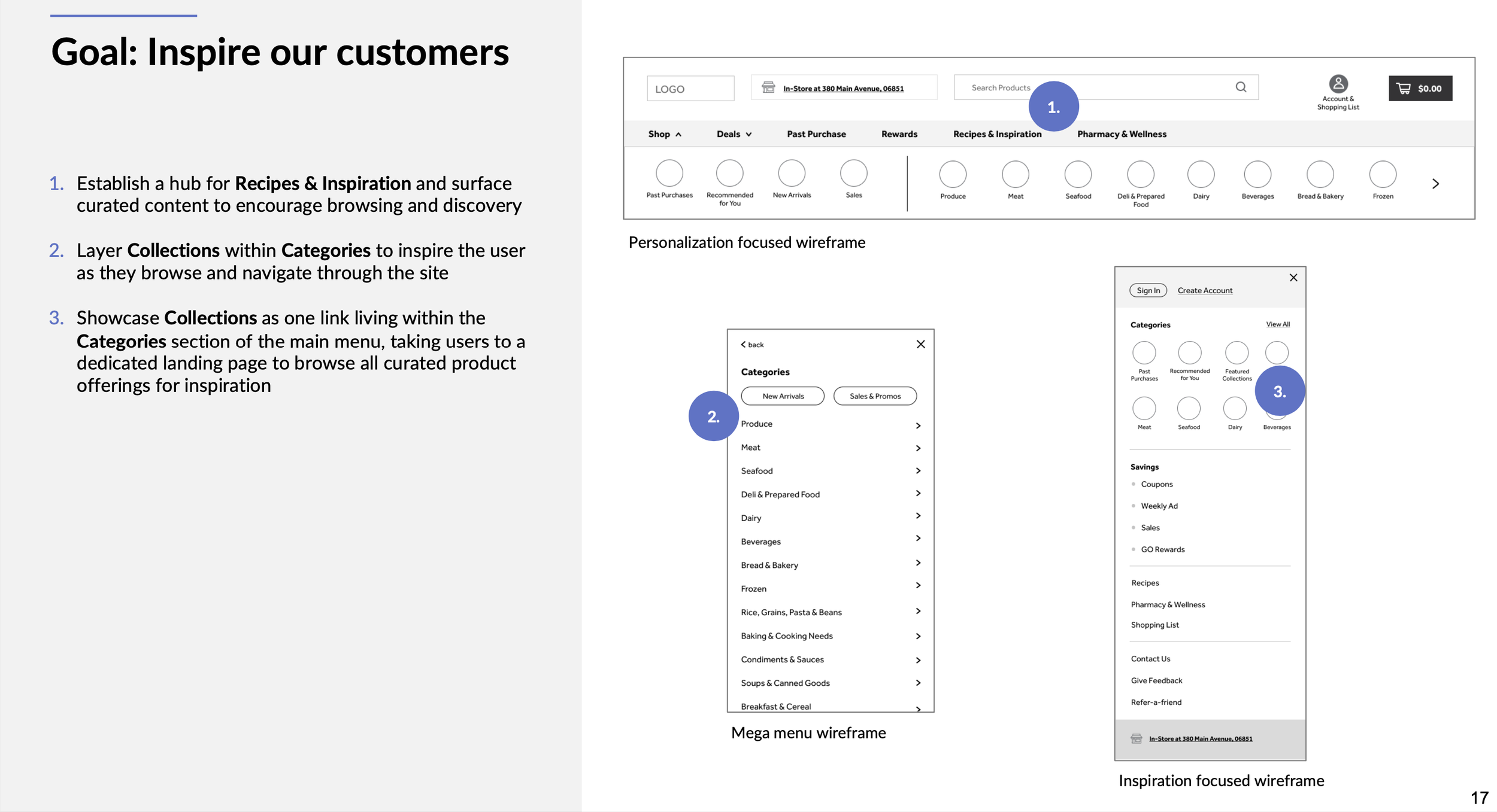
Lack of opportunities for cross-category exploration. Insufficient within-site traffic to seasonal or inspiration content.
(Over 80% add-to-carts are through direct search.)
Complex IA
The IA and taxonomy are confusing. Customers have difficulty finding their products. Sometimes they get lost on the site.
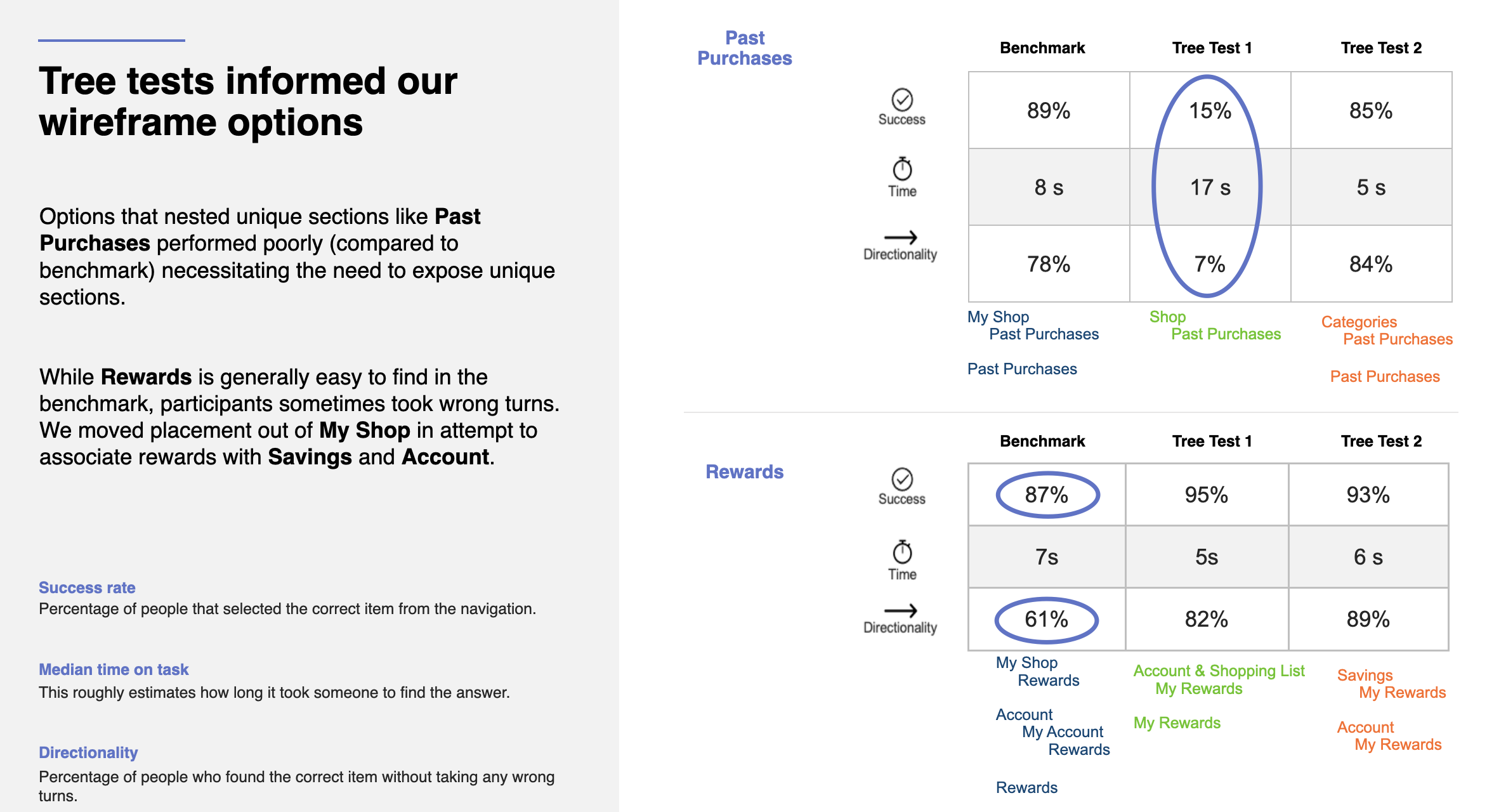
(In our taxonomy test, the control group performed significant poor than other options.)
Our Approach
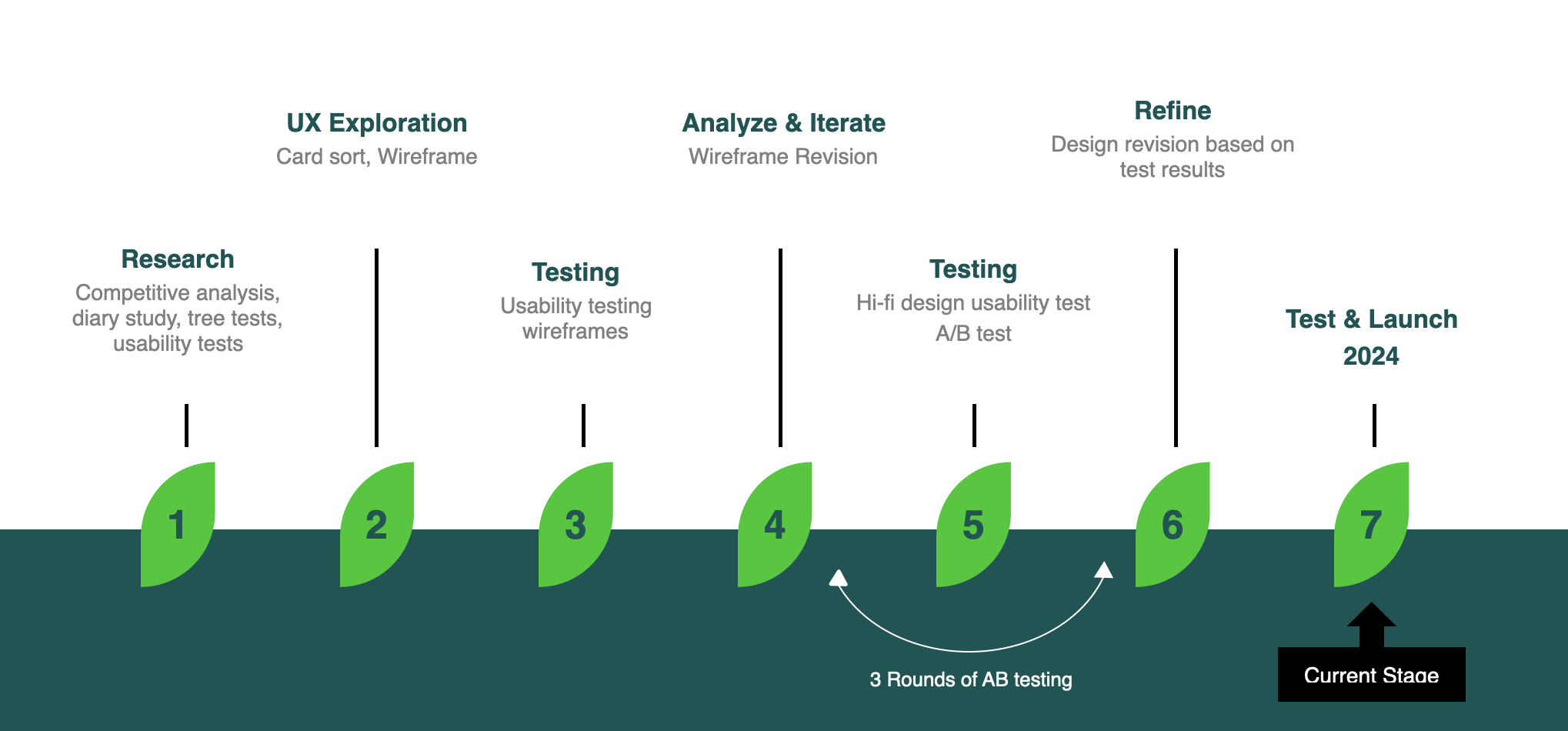
We take our research and test findings very seriously. We understand any changes on navigation can drastically impact our site performance and revenue. Our approach combines both qualitative and quantitative methods to maximize our confidence in our final design. Throughout this process, we’ve utilized various types of UX techniques such as workshop, interview, card sort, tree test, moderated and unmoderated usability test and Full-stack A/B test.
Additional Learnings
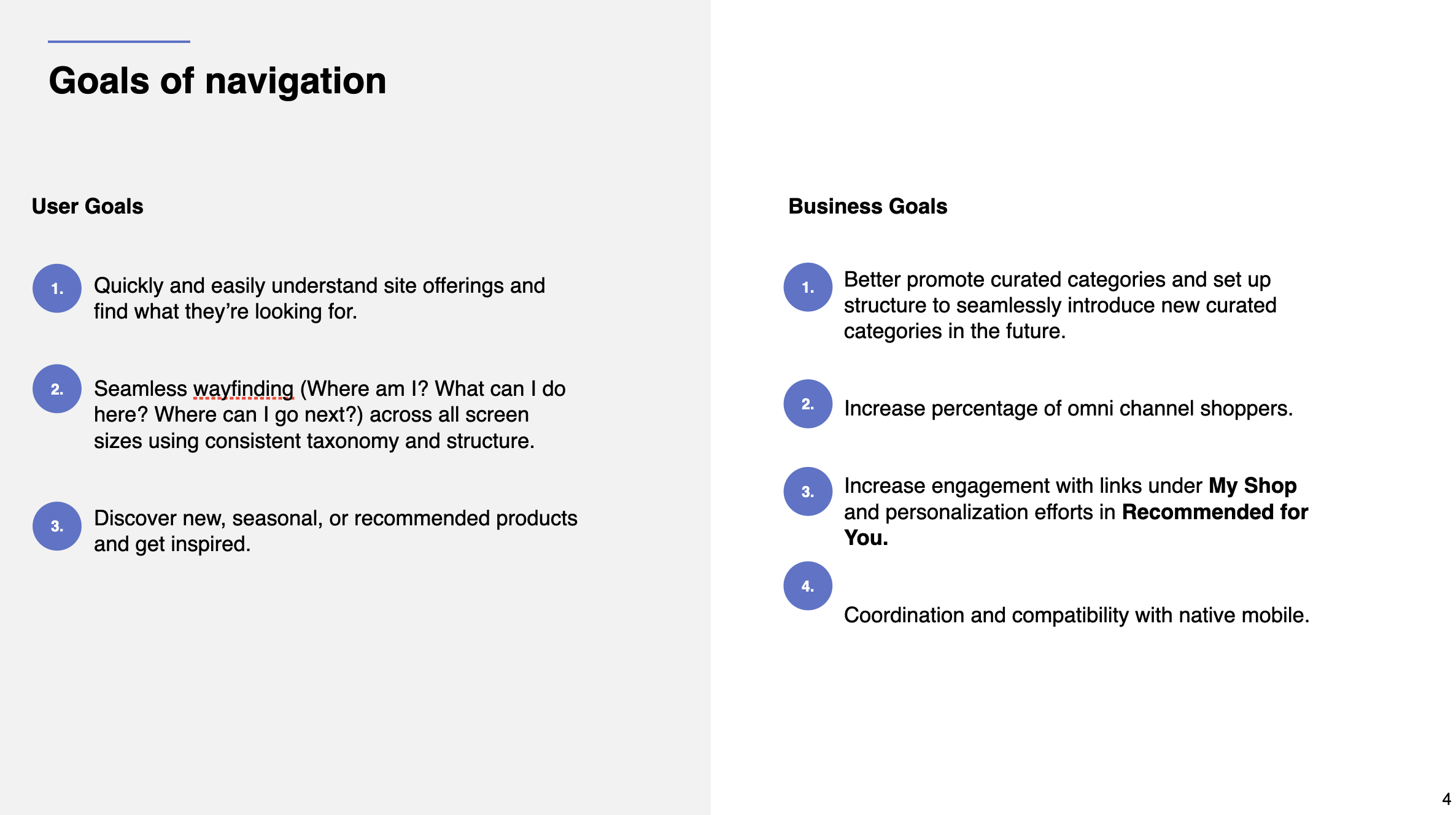
During this phase, designers and product owners have collaborated closely to co-define the user and business objectives, as well as the measure of success. Soon after aligning on these goals, we conducted open card sorting, tree testing, benchmark testing and A/B testing for taxonomy. After numerous workshops and review, we were ready to EXPLORE.
Explore Solutions
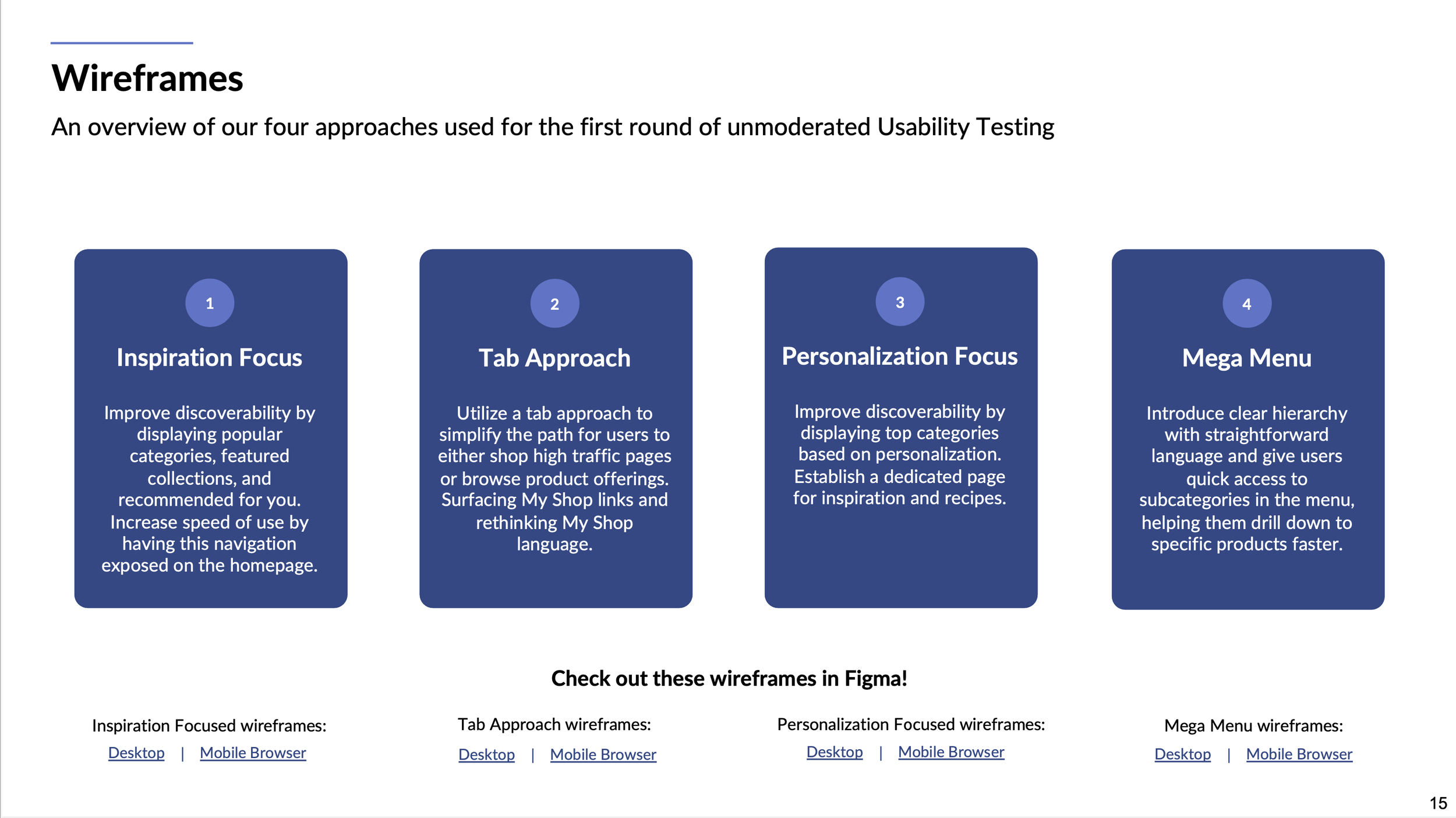
My favorite UX exercise is whiteboarding, either using FigJam or an actual board. It helps designers quickly get their ideas out without needing to delve into the nitty-gritty details. We started with a team-wide whiteboarding session and narrowed the ideas down to four main approaches. After a quick round of unmoderated usability test, we narrowed down to two winning approaches. From there, we moved onto Hi-fidelity design mocks.
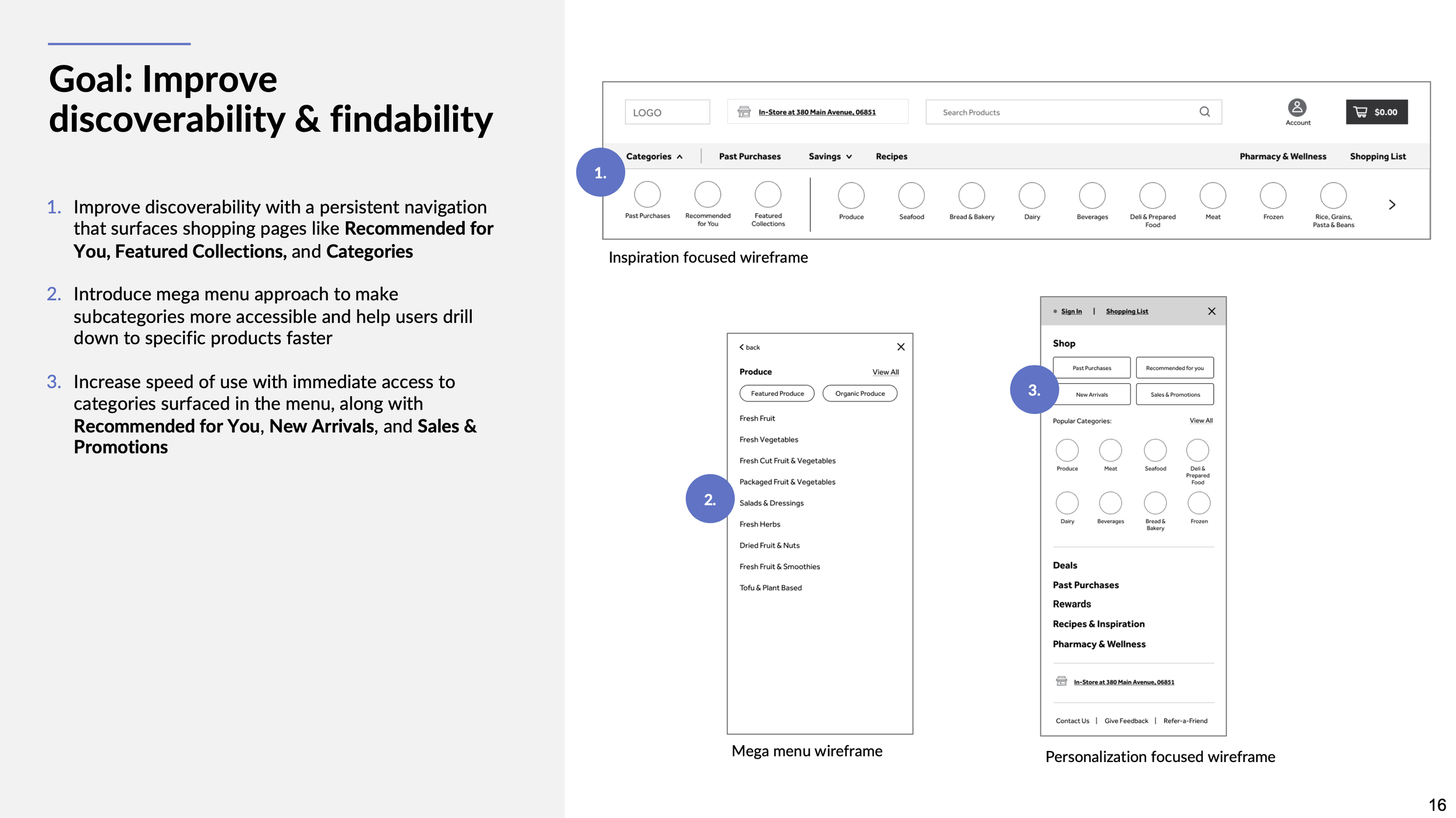
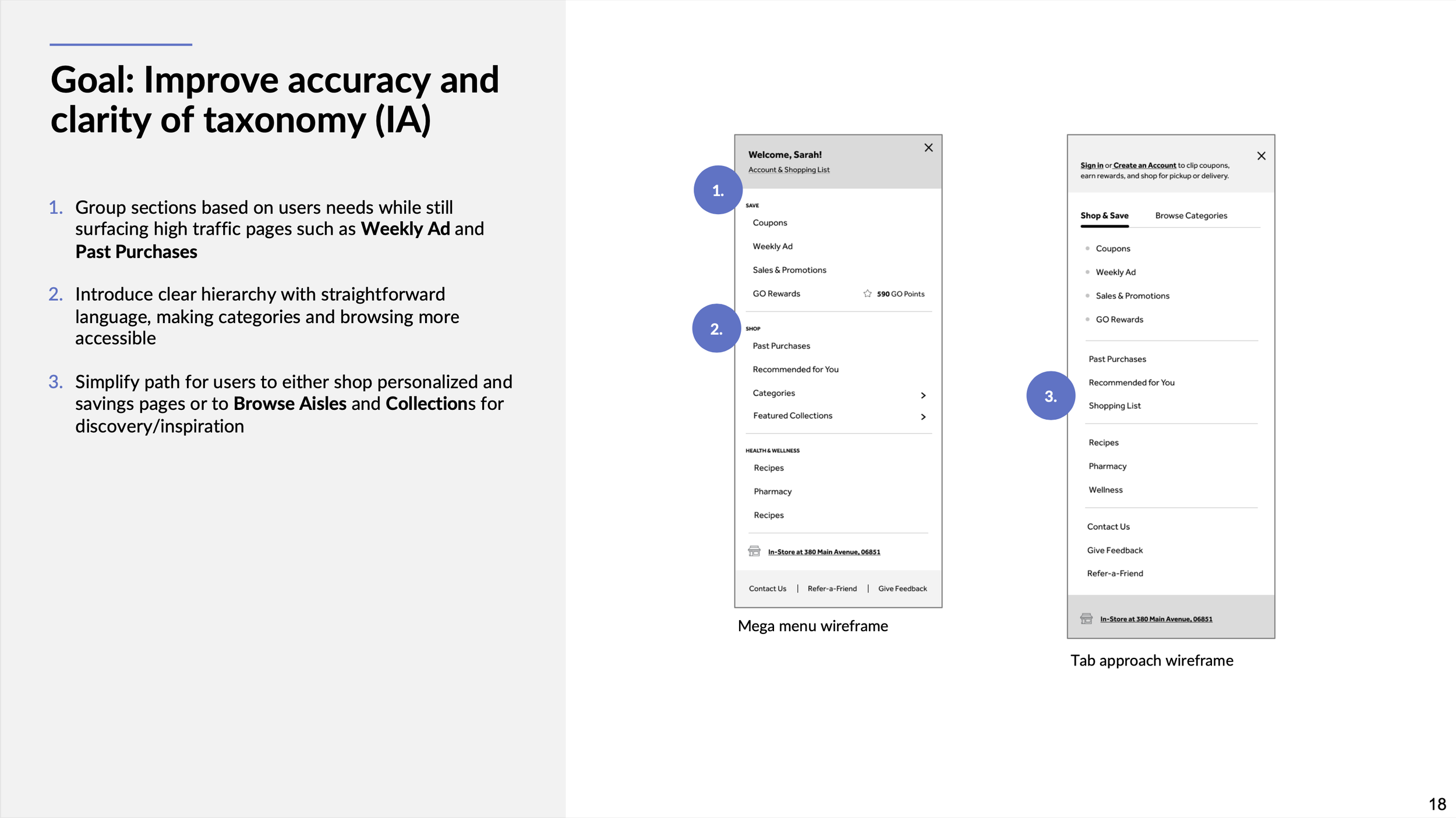
The Winning Solution
The final design exposes Browse Aisle categories upon landing on the homepage . It helps users quickly drill down to the category page that they are interested. All high-revenue pages remains in the primary navigation which can be easily accessed throughout. Using iconography not only draws user’s attention but also elevated the overall digital brand experience.
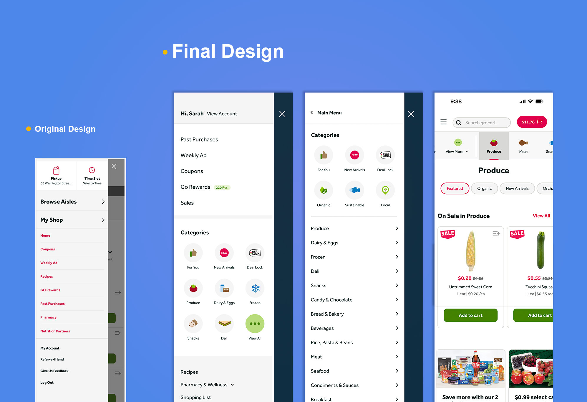
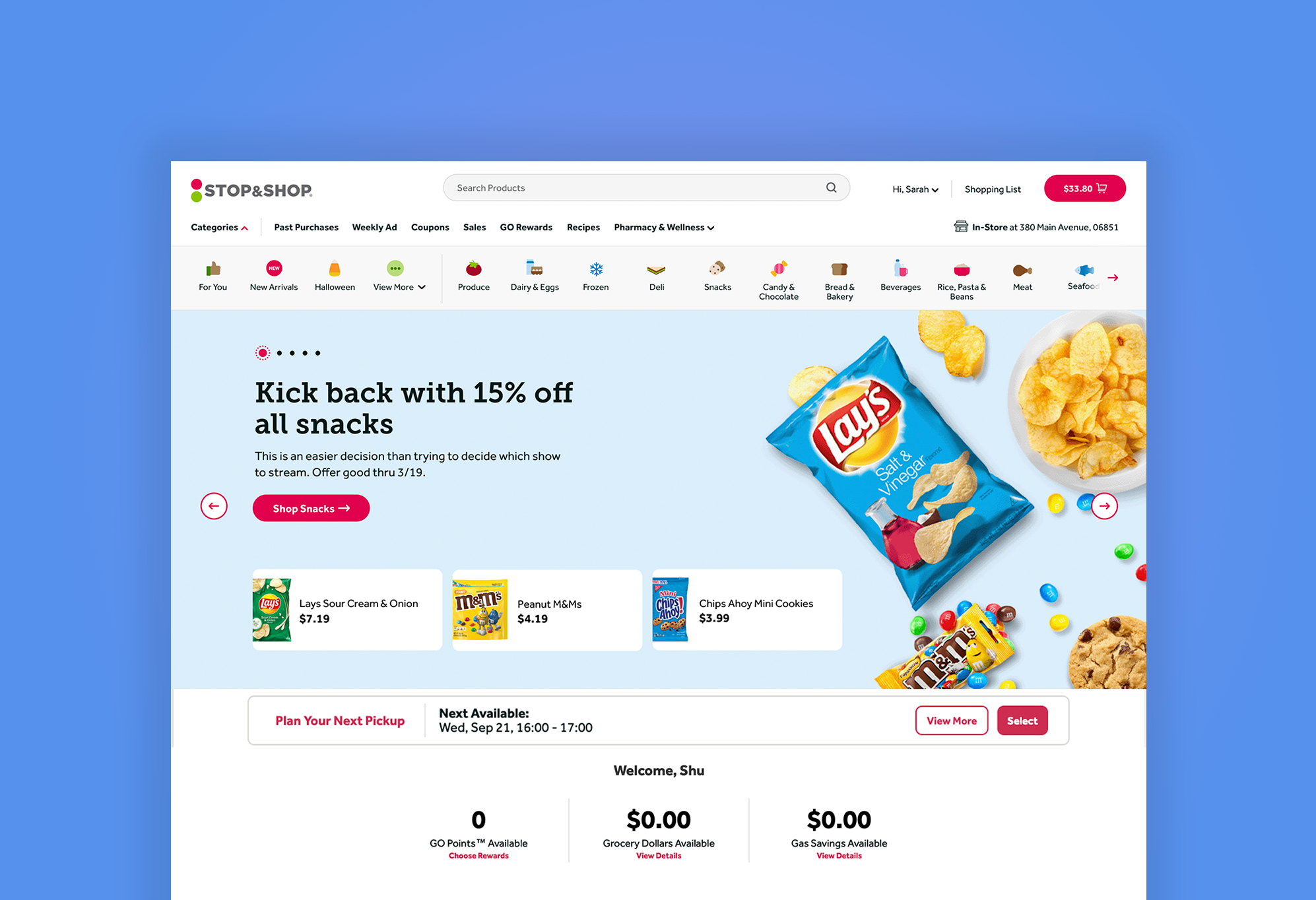
The Impact
+ 12.48%
Primary Navigation Click through
+73.19%
We collaborated closely with our engineering and analytic teams, and launched three rounds of full-stack A/B tests. Each test, we split the site traffic to 50/50 between control group and test group. There are three main areas that we are monitoring:
Way Finding: measuring Click-through Rate, especially for the underperforming areas.
Purchase Behavior: measuring Add to Cart to understand how users find the products they are looking for and where they add them to cart.
General Metrics: Monitoring whether the new design has a negative impact to general performance.
Business Metrics: Monitoring whether the new design has a negative impact to e-commerce performance such as conversion rate, basket size, AOV and revenue per visitor etc.
Category Pages Page View
+48%
Category Pages
Add to Cart
+ 4.12%
Seasonal Pages Page View